Med App
Assisting users in efficiently managing their health and travel itineraries by offering timely reminders for medication consumption and refills, as well as generating comprehensive packing lists for trips. The application is user-friendly, efficient, and consistently available.
2022
OVERVIEW
Med App is an academic initiative designed to enhance the management of medications, ensuring that users consistently adhere to their prescribed dosages and do not overlook essential medications during travel. The primary objective was to develop an intuitive and user-friendly interface that seamlessly incorporates medication reminders and packing lists, addressing the prevalent issue of medication mismanagement.
ROLE
Lead Product Designer
SKILLS
Product Thinking
User Research
UX / UI Design
Graphic Design
PROJECT TOOLS
Figma
Google Forms
Dovetail
Microsoft Teams
FEATURE SETS
Travel Packing List
Sharing Medications
Smart Watch Integrations
DELIVERABLES
Mobile App
Smart Watch App
THE PROBLEM
Over 50% of people regularly forget to take their medication, leading to missed doses and health risks.
HYPOTHESIS
Millennials and Gen Z prioritize efficiency and convenience in their routines, often seeking cost-effective solutions to avoid additional expenses.

Med App will assist users in finding economical ways to save money by being prepared for travel, while also managing their medication effectively.
PRIMARY RESEARCH
Unveiling User Needs and Market Gaps
To thoroughly understand the end users' needs, frustrations, and limitations, I employed a variety of UX/UI research methodologies. These included conducting in-depth user interviews to gather qualitative insights directly from the users, which helped in identifying specific pain points and desires. Additionally, I performed desk research to analyze existing literature and case studies, providing a broader context and understanding of current market trends. Market research was also a key component, allowing me to identify gaps and opportunities within the industry, ensuring that the design solutions were not only user-centric but also competitive and innovative.
User interviews
To gain a comprehensive understanding of the target audience, I conducted semi-structured interviews with individuals who regularly use medication reminder apps. This approach provided diverse insights into their daily routines, challenges with medication adherence, and preferences for app features.
INSIGHT 1
Research highlighted that users often miss their medication schedules due to forgetfulness or travel, leading to unexpected costs when medications are left behind. Current apps lack features that integrate medication management with travel planning, presenting a clear opportunity for enhancement.
INSIGHT 2
Users expressed a lack of motivation and engagement with existing apps, often citing that the interfaces were not intuitive or interactive enough to maintain their interest. They desired features that would not only remind them of their medication schedules but also provide personalized encouragement and rewards for adherence, making the process more engaging and rewarding.
DESIGN PROCESS
I utilized the Double Diamond and Design Thinking frameworks to refine my design strategy, enabling thorough exploration and focused action
IDEATION
Innovating reminder features and enhancing user engagement
Pinpointing core issues and user needs to increase engagement
USER FLOW
Designing User Flows to Ensure an Intuitive Experience for These Users
User flows are essential for visualizing the user's journey, ensuring a seamless experience from start to finish. By analyzing how users will interact with the app, I can pinpoint areas of friction, enhance interactions, and create a more intuitive experience that keeps users engaged and accountable in their daily routines when it comes to medication use.
PROTOTYPING
Developed wireframes and prototypes to visualize and test these features
PROTOTYPING
Optimizing designs for both mobile and smartwatch platforms
I designed the application to be simple and easy to read, with vibrant colours to keep users engaged while using the application on both smartwatches and mobile devices. By utilizing the main design system from the mobile version, I was able to implement a seamless design framework for smartwatch devices on iOS. Additionally, I adhered to WCAG colour standards to ensure accessibility and enhance the user experience, demonstrating a commitment to inclusive design practices.
SUMMARY
Ensuring a seamless and intuitive experience for users to manage their medication schedules on both smartphones and smartwatches.
This project was dedicated to empowering users to effectively manage their medication schedules and inventory levels, ensuring they remain engaged with the app's features. By integrating user feedback and innovative design solutions, the app not only helps users adhere to their medication routines but also enhances their overall experience. Thank you for taking the time to review my case study. If you're interested in discussing UX/UI design and potential opportunities, please feel free to reach out.
Overview
Project Results
01
Faster sign in times
Quickly and securely sign in with just a tap, so you can skip the hassle and start enjoying your movie experience right away.
02
Created a split the bill option
Easily coordinate and split the bill with friends or family, making group orders seamless and stress-free.
03
Reduced idling by pre-ordering food
Conveniently pre-order snacks and drinks before arriving at the theatre, ensuring your favorites are ready when you are.
The Vision
Movie Goer is a startup project to give users the power to purchase and reserve movie theatre tickets and seats ahead of time to save time by not having to wait in lineups. The vision for this product is to improve the users experience by discovering new opportunities in the form of features. I will start this process by conducting user research so that I can identify opportunities that I will then design for.I started by creating a research plan to determine what steps I would need to follow in order to get the information I need from the prospective of the end user.
The Problem
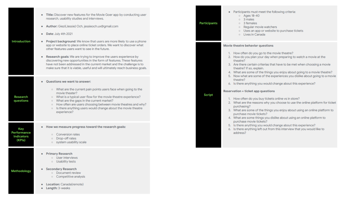
Most movie theatre applications already have this feature. It is my job to uncover what new features that can contributed to attract users between the ages 18-35 who enjoy going to the movie theatres.
UX Research
Discovery
Primary Research
I began by discovering the current frustrations and limitations regular movie watchers have today. Doing this allowed me to have a better picture of what questions to ask during user interviews.Once I discovered the opportunities, challenges and gaps in this market, I was able to empathize with the user.
Secondary Research
Since Covid-19 left most of us unable to enjoy movies inside a movie theatre, we saw a 40-80% decline in ticket sales between 2020 and 2021. Because of this, I wanted to focus my research before 2020.Prior to 2020, Movie theatres were seeing an increase in online movie ticket purchases compared to in store purchases. This means that users are more likely to use a mobile app for their future ticket purchasing needs.
‘‘28% of online ticket shoppers said they picked the theatre because of reserved seating, while only 7.6% of those who bought at the theatre listed that as a reason." – Forbes.com
User Interviews
After completing my research, I moved on to user interviews to gain deeper insights into the overall movie theatre experience. I developed interview questions aimed at understanding the key features users would find valuable. The participants regularly visit movie theatres and use apps to purchase tickets, making them an ideal group for this study.
UX Research
Define
Insights
Primary and secondary research showcased the progression mobile apps are taking in the movie theatre market, while user interviews showed the gaps and user needs that are not currently met. This allowed me to empathize and gain insights for my ideation phase.
Opportunity Areas
Having a clear picture of what and who I was designing for based on my research findings allowed me to gain insights on opportunity areas for my design.It was at this point when I ran a competitive analysis to verify the opportunities I've discovered from my research gatherings. The competitive audit also allowed me to follow the current themes for design so that users can easily adapt to the new product.
Competitive Audit
The objective of this audit is to bridge the gap between well established products, and opportunities that haven’t been addressed with the users I’ve interviewed.

When comparing competitors, I wanted to answer the following:

- What is currently working in this market?
- What are some opportunities?
- How can I design to solve these opportunities?
- Can new features be viable to this business?
The VisionScoping
Once I was done my research gatherings, I organized my findings into “Viable” and “Out of Scope". Then boiled down these findings so that I could focus on one feature for the app.
Scope Findings
1) I discovered that I could design a pre-order feature for food and drinks. This will relieve some of the wait times users are currently facing when going to a movie theatre. I used large cap companies that have already established a pick up ready feature like McDonald's, Starbucks, and other retail stores as a reference guide to help the design process.

2) I noticed that users want to be able to bulk order tickets and seats from one user, then split the cost. I reviewed apps that have this feature like Uber to see how viable this feature is.
UX UI Design
Develop
Persona
I began by discovering the current frustrations and limitations regular movie watchers have today. Doing this allowed me to have a better picture of what questions to ask during user interviews.

Once I discovered the opportunities, challenges and gaps in this market, I was able to empathize with the user.
Problem & Goals
Since Covid-19 left most of us unable to enjoy movies inside a movie theatre, we saw a 40-80% decline in ticket sales between 2020 and 2021. Because of this, I wanted to focus my research before 2020.Prior to 2020, Movie theatres were seeing an increase in online movie ticket purchases compared to in store purchases. This means that users are more likely to use a mobile app for their future ticket purchasing needs.
User Flows
In designing the user flow, I focused on creating a seamless experience for users like Kingston who need to purchase multiple tickets while easily splitting the bill with friends. I also integrated a pre-order feature for food and drinks, allowing users to customize their orders in advance and streamline their entire movie-going experience. This approach ensures that group outings are hassle-free from start to finish.
Sketching
I created a final design sketch informed by my scope and user flow chart. This initial step focused on the core functionality of the Movie Goer app: purchasing tickets and reserving seats. The next phase involved adding options for ordering food and snacks, along with the ability to split the bill with friends.
Wireframing a prototype
Once I was satisfied with the sketches, I transitioned to wireframing to set the stage for usability testing. This wireframe included key functions like reserving movie seats, purchasing tickets, ordering snacks, and splitting the bill with friends. These features were essential for creating a smooth and intuitive user experience.
UX UI Design
Deliver
Mockups
In the final stage, I transformed the wireframes into high-fidelity mockups, bringing the Movie Goer app to life with polished visuals and a user-friendly interface. These mockups showcase the seamless flow from ticket purchasing to seat reservations, food pre-orders, and bill splitting, reflecting the needs and preferences of users like Kingston.Thank you for taking the time to view my case study.

Next Project

MovieGoer

Med App
Med App is a mobile and smartwatch application designed to provide user-friendly reminders for individuals who regularly take medication.

Additionally, Med App allows users the ability to create a convenient packing list for their necessary medications for traveling.
Process
Discover
The Vision
This mobile and smartwatch app ensures regular medication reminders and allows users to conveniently create travel packing lists for their medications. The vision is to provide an intuitive and user-friendly platform, allowing users to effortlessly add medication, generate packing lists, and explore new features identified through research insights.
Primary Research
To initiate my primary research, I devised a research plan outlining the steps required to gather valuable information from the end user's perspective. By identifying the end user’s for the Med App, I can then dive deeper into the current frustrations and limitations for users who take medication.

Once I learned about the relationship between users who take medication regularly and the tools provided for them in the current market, I was able to empathize with users on the challenges they may encounter.
Desk Research
Aside from learning about taking medication inaccurately, miss dosing, and refilling prescriptions, I also ran a competitive audit and looked into current reminder application features, user interfaces and reviews to influence the design.
User Research
In a 2017 high level study involving 1,198 adults, they were found to have medication delays 80–85 percent of the time and to have forgotten medication 44–46 percent of the time. -Healthline.com

After conducting research, I moved onto user interviews so that I could gain real insights from potential users, and gained helpful insights on user needs that are not being met in the current market.

I developed interview questions based around human behaviours to understand when and how participants take their medication. I was surprised by how often participants forgot to take their medication, and in some cases overdosing.

Some of the participants admitted that they forget to pack their medication which left them having to spend money that they may have not planned for.
Define
Insights
Primary and secondary researched allowed me to address issues that not many users may have regularly, while user interviews showed the gaps and user needs that are currently not being met in the current market. I gathered and organized the data collected from my research into “Insights” & “challenges”. I then prioritized these insights and challenges to narrow down areas of focus for the design.
Opportunity Areas
At this time I also ran a competitive audit to verify some of the gaps and challenges discovered from research gatherings so that I can prioritize features for the Med app. The competitive audit on other reminder apps allowed me to have a refer to a design template that may feel similar to products users are already familiar with like alarm clocks and calendars.
Develop
Developing Personas
Once I have created personas and highlighted features within my scope, I created a user flow to showcase the path a user would go through and the interactions on the way to successfully use the Med App’s core features.


This proposed user flows contains main 2 key features:

+Creating a packing list for travel
+Quick response on smartwatch
Deliver
Case Study Summary
The Med app introduced fantastic updates, making it a convenient and intuitive way to remind users on their upcoming medication and preparing for travel.

As part of an educational project during my UX Design bootcamp courses, I worked on the Med app. This case study aims to illustrate my approach to digital product design, addressing challenges while aligning with both business goals and user needs. 

Projects
Have a project in mind?
Let's Connect